
Digital Photography |
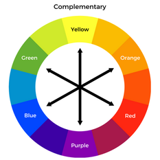
Colour Theory in productIn product photography, is obviously very important due to most advertising being to sell a product or and idea. The product being the main selling point, is most likely the main focus and in the centre of the shot.
Health & SafetyThe studio is a room filled with equipment, which makes it more hazardous to tripping over or injury while using the equipment.
Equipment
Pinterest/InspirationsAs I am photographing my phone in my product photography, I thought it would be wise to take a look at some phone adverts to keep it relevant to my topic. I also really wanted to try painting with light, so my inspirations use some sort of lighting in there pictures so I develop an idea for my own photos.
Image NO.1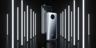
A strong influence on my product photographs, this image is most likely advertising a mobile phone. The phone is standing, which leads me to believe they have used some kind of stand behind where it isn't visible or used string and hung it. I really think the advert is eye catching, the lights on the sides of the phone give a really nice effect. The most likely used multiple strip lights to create the lights on the side, they have also used a reflective surface which really gives the image depth.
Image NO.2
My Images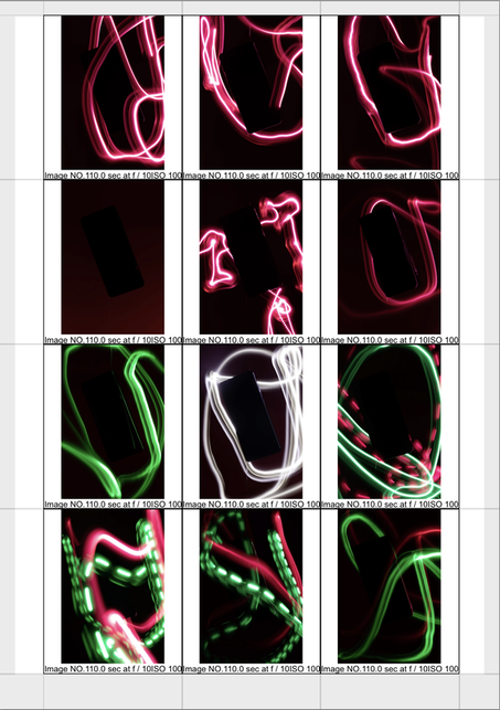
In my product, I wanted to achieve a complimentary colour scheme using the method painting with light. These images were achieved by setting the camera shutter speed to its lowest, and using a light and moving it.
Image NO.1- I used a red colour gel filter over the flashlight, I haven't attempted to achieve my desired complimentary colour scheme as this image was more of an experiment to become more acquainted with painting with light. The image overall could be improved, the light is very sporadic and messy which is visible in all of the images. Image NO.6- Once again I used a red colour gel filter over the flashlight, this image was a lot better the light isn't really harsh like the first image and is a lot less messy and feels more fluent. One possible way for improvement is getting that solid outline between the phone and the background, as it get lost in the background I could achieve this by using the more harsh light around the phone. Image NO.9- Ive used two flashlight both with different colour gel filters. In this image I have achieved my desired colour scheme although the painting with light is once again messy. What I found really interesting is making the line of light broken, as is visible in the red light I used this to separate the different lights from one another as well as the colour. Image NO.12- In this final image, I have once again accomplished my goal of a complimentary colour scheme using red and green. The painting of the light is much better in this image and a lot more subtle, but this didn't come without compromise as the phone has faded into the background and is barely visible. A way to improve would possibly lighting the background dimly so the phone is separated from the background. Edits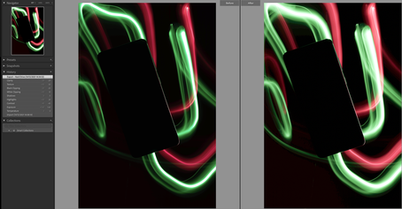
In my edit for my product I still wanted to keep it looking realistic and not make drastic changes. Most of my editing on this image was for adjusting the lighting brightness as some bits of light are dim in the normal picture.
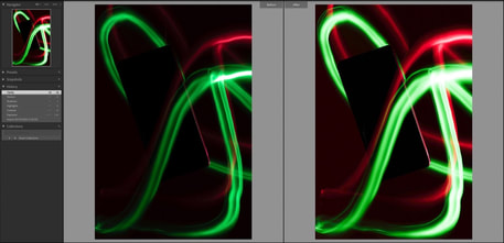
In this edit the original image overall turned out to be a bit dark, I should've adjusted the exposure to make it more brighter. I adjusted the lighting and I'm happy that the phone outline is fully visible, this is what I wanted to achieve with this edit and im happy with the way it turned out. ReferencesThe Paper. n.d. Color Theory: Color Harmonies | The Paper Blog. [online] Available at: <https://blog.thepapermillstore.com/color-theory-color-harmonies/> [Accessed 8 November 2021].
0 Comments
Leave a Reply. |
AuthorReiss Blackman Archives
February 2022
Categories
All
|

 RSS Feed
