
|
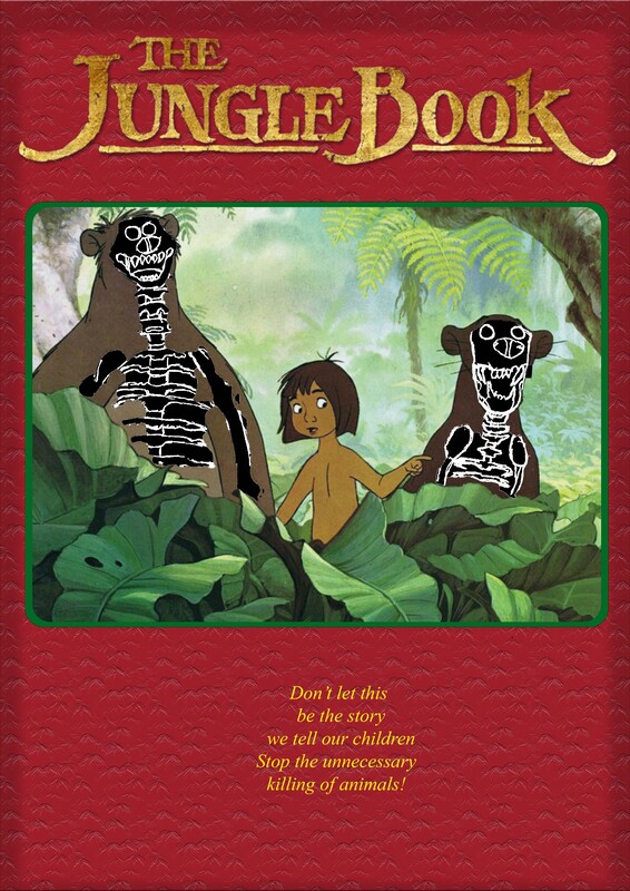
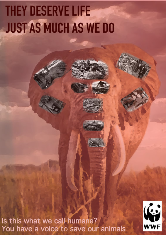
In this project, we needed to compose three posters with the appropriate planning and research into our chosen subject. For my subject I chose animals rights as this is an area, I find passionate about. Researching for this project was very tough, seeing the disturbing facts about animals opened my eyes to how evil this world is. I researched facts, posters and other imagery to form ideas for each of the posters. For the first poster, I generated the idea of making a book cover using an image of The Jungle Book it was a challenging task to convey my message of the killing of animals but keeping it acceptable for children to view. To accomplish this, I needed to think about the composition of the image, so it is not explicit, notable that in certain religions visual representation of skeletons is seen as a bad omen such as in China it is illegal for skeletons to be shown. My chosen colour technique was complimentary, green to represent nature and red symbolising blood and rage. Colour made a drastic impact on my work as I wanted the colour to have a convey the meaning. The font was quite easy to pick out for the title I used the official title for The Jungle Book; then for the copy at the bottom, I wanted to position it to make it look like where the authors name would be on the book with a font that resembles a children’s book text.  For my second poster, I produced the idea of a montage of graphic images encapsulated into one image of an elephant. More of a sophisticated layout, I wanted to achieve a poster design like WWF posters and make it for a mature target audience. Graphic images are depicted in this poster, making it unsuitable for a child's viewing making it difficult to place in public spaces. Once again colour made a strong impact on my decision for the poster colour technique, I used a monochromatic colour scheme. I achieved this by using a red overlay over the image to once again symbolize the bloodshed of animals that are over pillaged. I used a dark red bold font, as suggested by one of my peers and made the text at the bottom white as it was not very visible against the grass. I had a few issues with the images over the elephant as they didn’t stand out, so I changed them to B&W after the peer discussion.  For my final poster, I wanted to make it professional and have a wider target audience making it suitable for all audiences. For this poster, I took inspiration from a poster that I found on the internet for animals on an underground train station. I researched endangered species on the WWF website to decide on an animal to choose for the main image on my poster. I saw that a specific species of turtle was critically endangered and being a tortoise owner, it made the choice on the animal quite easy. I used a harmonious colour scheme, I wanted it to be less aggressive and more of a sympathetic colour scheme hence why I used the picture of a turtle in a tranquil blue sea to emote the feeling of sadness. The layout of the text is less incorporated in the image, which I think personally makes this image better. The banner the text is on makes it look a lot more sophisticated this being my intention with this poster design. Originally, I had a different layout with text on the photo, but I changed it as suggested by my peers, so the image of the turtle was as visible as possible.  For all my posters, I referred to the Advertising Standards Agency (ASA) as a guidance to rules and regulations I needed to follow to make my posters appropriate for public display. If I could do this project again, I would select a wider variety of media even taking some of my images as opposed to getting images from the internet. This project meant quite a lot to me as I have always loved animals and am disgusted by how animals are treated.
This was the first time, I used text and the cutting tools on Photoshop to create posters, I feel that my skills developed over time, and this can be seen in my 3rd posters and as I adjusted the originals after peer feedback. I also placed the posters into areas where they could be seen by the public, to reinforce the audience.
0 Comments
Below is a link to my word document on the work of an art director, describing what art directors do and selecting my own example of a successful art direction.
 ReferenceAnon, Apex Legends, Nintendo. Available at: https://www.nintendo.co.uk/Games/Nintendo-Switch-download-software/Apex-Legends--1910595.html [Accessed January 19, 2022].
Today we were told to come up with ideas for a poster, which was really exciting as my brain was full of different subjects that I could base it but in the end I made my mind on animal posters I also had to take the colour scheme into account. Mind map & Ideas
Unrefined In this poster, I wanted to display more of a sinister and more realistic view on animal endangerment. I used the image of an elephant, and selected multiple shocking images of elephant pillaging and compiled all of them on the elephants head. I added a font which is bold and stands out one text being incorporated into the image, and one not. This poster is aimed at the general public, but more towards the older side to speak up against animal poachers. I have used a red monochromatic colour scheme to symbolise the blood of all the animals being slaughtered.  This poster is a display of the Jungle Book ,however in order to spread awareness of current animal endangerment issues skeletons have been placed over the animal characters. I wanted to a poster aimed at the ,general public mainly parents and kept it suitable to allow it to be positively viewed without being to graphic. I have used a complimentary colour scheme in this poster. I gathered an image of the Jungle Book characters, and drew out skeletons to match the characters bodies. Once the skeletons were drawn, I upload the image then made some adjustments so the skeletons fit on the characters. I then used the Jungle Book font at the top, and added the background to give it the general aesthetic of a children's book.  For this poster I wanted it to be more professional, a lot more assertive and regimented. In this poster I gathered an image of a turtle and made a square shape to fit half of the page and the turtle to fit the other half. I wanted my text to be bold, in order to this I used quite bold colours over the black in which I choose white and green. I used the WWF logo at the bottom along with another associating company. Refined A few minor tweaks, using my peer feedback I removed the green banner that over layed the bottom of the turtle images as it blocked the image. I altered some of the positioning of the text, so it looks more sophisticated as this was my vision for this poster. I also added a references to the WWF website, to solidify my intentions for this poster and what its about.
Historical
Contemporary
They have also put the WWF signature logo at the bottom, branding it to them. It is quite a powerful advert, highlighting some of the issues that are happening with regards to animals, and you can generally tell that our outlook on animals have changed drastically. ConclusionBoth adverts are brilliant representations of the two different time periods, it Is quite clear that in the historical advert you can see the animal is an accessory on the woman. However, in the more modern advert the animal is the main subject.
Both adverts show the animal as the main point, although they express different views and morals. Both images involve text, although the modern advert integrates the text a lot better than the historical. The progression of economy is quite visible, as the historical image is black and white most likely due to It being more expensive to print in colour the modern image on the other hand is coloured showing how printing has developed through the years. The language used are severely different, in the historical image it is used to announce a “Bargain” on the price of animal furs. But the contemporary on the other hand, the text is used to spread awareness of an idea to keep animals safe. Below, is a link to my animal rights advertising timeline.
To see colour is an important day to day aspect, which we as humans use to ;express emotions, sell a product, convey a message etc. Colours have different personalities as some colours are defined as being cool and warm. Cool colour is more calming and relaxing, warm colours on the other hand are vibrant and excite the viewer.
Colour Wheel
Complimentary ColoursComplementary colours are on opposite sides of the colour wheel, which as the name states the two colours compliment each other. For example red is complementary with the colour green etc.  This is an advertisement for Alice in Wonderland, as you can see they have used the red and green complimentary colours which really draws you in as the relationship between the colours makes the image very vivid and eye catching. As is visible they have used green for the majority of the image ,but added the hint of red as to not overwhelm the viewer. More about complimentary colouring, is displayed in my product photography on a separate blog post. Analogous ColoursAnalogous colours are side by side on the colour wheel, harmonious colouring usually consists of three colours.  This advertisement for Kung Fu Panda, harness analogous/harmonious colour to create a nice flowing image. The colours really resonate off of each other, this creates a nice subtle diversity of colour which keeps the image flowing but keeping the viewers attention. More about harmonious colouring, is displayed in my food photography on a separate blog post. Monochromatic ColoursMonochromatic colours are various shades of one colour. For example a light blue against a dark navy blue.  This advertisement is for Halls, Mints they have utilized and monochromatic colour scheme to create a visual pleasing image. The various blues used give the image a really nice subtle change , its almost like the more you look at it the more different type of blues used are visible. The whites infused with the blues give almost and artic effect. More about Monochromatic colouring, is displayed in my colour gel photography on a separate blog post. Colour PsychologyPhyscology in colour is very important, wether it be to grab the attention of a viewer or to envoke an emotion it can be used to make the viewer feel more connected. In our colour psycholgy lesson, we were asked to look through a series of images and describe how they made us feel. Physcolgy in colour can be viewed in a wide variety of different ways thus people will have different opponions on an image. The Pictures below are the images we viewed:  Mark Rothko, 1969, Black on Gray Mark Rothko, 1969, Black on Gray As you can see this is a monochromatic piece of art made by Mark Rothko, althogh this image is simple it envokes alot of emotions and it was interesting to hear others views on the piece and not just my own. I feel it envoked emptyiness, a sense of loss of identity i feel the black and the grey just makes the image seem to have alot of space. Another really interesting concept raised by one of my peers, is that it envoked mystery and related it to the moon which I thought was quite insightful.  Yves Klein, 1957, International Klein Blue (IKB) Yves Klein, 1957, International Klein Blue (IKB) This blue monochromatic piece composed by Yves Klein , this image really didn't do much for me It did't really envoke any sort of emotion. The first and only thing I could think about, is sadness as I associate the colour blue with sadness. One of my peers said it reminded them of depth, like the ocean and its vastness which I thought was a really good annalgy.  Yayoi Kusama, Dot Obession Yayoi Kusama, Dot Obession This room painted red with white dots by Yayoi Kusama , emoted fun and almost optical illusion for me. The bright colouring used really gives that feel of a childhood play area. One of my peers said it looked like mushrooms, which obviously didn't really attach any emotions of sorts to the image however I thought it was a very good insight. To complete our colour psychology we were told to compose a piece of work using colours to impose a mood or expression, I found this activity very fun and therapeutic.  The above image is a depiction of my psychology of colour, I used blues mixed with grey to make a sky and they also show all the dark thoughts and the sadness. I then used white for a cloud, I feel white is soft which I used to show safety and added a little bit of grey in the cloud surrounding myself to show the safety being corrupted from the dark thoughts. I used my regular clothing, however it can be perceived as the dark thoughts engulfing me and turning me dark. I also made my self faceless to show more about loss of identity which is an emotion that everyone feels at some stage, I wanted to make a personal image but also a relatable one. Colour HistoryThe Egyptian's used 6 main colours in there art, these consisted of red, green, blue, yellow, white and black. Colour in Egyptian art was highly symbolic and regulated. Allegedly there complimentary colours were a bit different to ours, which I found quite interesting for example Red was complimentary to white.
ReferencesAnon, Angry emoji, Google. Available at: https://hotemoji.com/pouting-face-emoji.html [Accessed January 21, 2022].
Anon, 2019. CMY Color model, geeksforgeeks. Available at: https://www.geeksforgeeks.org/python-cmy-and-cmyk-color-models/ [Accessed November 21, 2021]. Anon, Heinz ketchup advertisement , Heinz. Available at: https://www.pinterest.com.mx/pin/636766834784383765/ [Accessed January 21, 2022]. Anon, Light Dispersion Conceptual Waves, AAAS. Available at: https://www.aaas.org/isaac-newton-and-problem-color [Accessed January 21, 2022]. Anon, Mint Monochrome example, Halls. Available at: https://in.pinterest.com/pin/48906345929491703/ [Accessed January 21, 2022]. Anon, RGB Colour Model, Available at: https://www.hisour.com/rgb-color-model-24867/ [Accessed January 21, 2022]. Anon, STOP sign, Available at: https://www.abcteach.com/documents/clip-art-signs-stop-sign-color-i-abcteachcom-17163 [Accessed January 21, 2022]. Rothko, M., Untitled, MarkRothko. Available at: https://www.mark-rothko.org/untitled-black-on-grey.jsp [Accessed January 21, 2022]. Rikard, 2015. Alice in Wonderland example of complimentary colour, Available at: https://zevendesign.com/color-harmony-hulk-wears-purple-pants/ [Accessed January 21, 2022]. Velarde, O., KungFu Panda Harmonious example, Available at: https://visme.co/blog/color-psychology-in-marketing-the-ultimate-guide/ [Accessed November 24, 2021]. |
|||||||||||||||||||||||||


 RSS Feed
