
Digital Photography |
Colour Theory in foodColour theory in food photography/advertisement is important, to draw in the viewer and compliment the food/drink being advertised.
Health & SafetyThe studio is a room filled with equipment, which makes it more hazardous to tripping over or injury while using the equipment.
Equipment
Pinterest/InspirationsTo gain some inspiration I took to Pinterest to find some ideas, my colour scheme was harmonious colouring for food photography therefore I searched for some harmonious colouring.
CompositionSomething I needed to decide before I shot my images, is how I wanted my focal points and I needed to decide where my items would be placed as well as angle of the camera. I decided I wanted a head on shot, and wanted to use the golden triangle.
My Images
My images have turned out perfectly, I captured the images I wanted adjusting certain aspects of different images such as adjusting how much light gets through or placement of objects. I have overall achieved my harmonious colour scheme, by using the yellow/gold ball ball on the platter the orange cinnamon stick and and the red ball balls dangling above.
Image NO.1- In this image I captured you can clearly see the hot chocolate is the main focal point, I tried to get enough light so I could get a highlight on the glass which was achieved. The positioning of the red ball balls weren't how I pictured them, I wanted depth to be captured by the ball ball in the back being just behind the other sparkly ball ball which I rectified in the next images. Image NO.3- This image corrects the ball ball issue that I had in the previous picture, although due to movement of the ball ball there is some motion blur. Other parts of the image have not been adjusted, although I could've improved this image by moving the placement of the hot chocolate and making a few tiny tweaks. Image NO.4- As you can see, this is one of my final images I have adjusted the positioning of the hot chocolate and It has made a huge improvement. I also added some detail by adding a sprinkle of chocolate powder on the cream, small detail but adds a lot to the image. The red ball balls are perfectly placed, and haven't been affect by motion I am very happy overall with the aesthetic of the image.
This is how I set up my scene, I needed assistance to hold up the red ball balls so I had aid from one of my classmates. The fairy lights were attached to a stand which I strung over the background and I used a red background for the Christmas theme.
Edits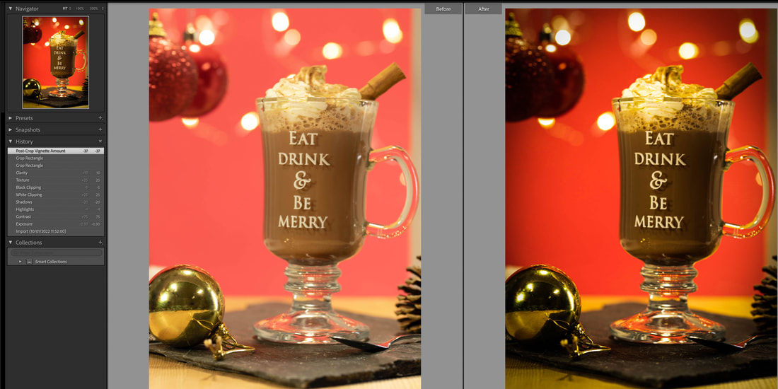
In this edit for my product photography, making the image more darker was my main priority for this I obviously adjusted the exposure. I wanted to give the image a bit more of a Christmas advert aesthetic and I think the image looks far better I also photoshopped the reflection of the setup out of the front ball ball as the camera and I were visible. References Baier, L., n.d. What Is The Rule Of Thirds And Why Is It So Important in Food Photography?. [online] Asweetpeachef.com. Available at: <https://www.asweetpeachef.com/rule-of-thirds> [Accessed 16 January 2022].
Fubiz, 2022. Playful and Colourful Food Compostions. [image] Available at: <https://www.pinterest.co.uk/pin/301600506296221014/> [Accessed 14 January 2022]. Peters, C., n.d. Food Photography Composition Using The Golden Triangle. [online] Food Photography Blog. Available at: <https://foodphotographyblog.com/food-photography-composition-using-the-golden-triangle/> [Accessed 16 January 2022]. Photographyhero.com. 2022. The Golden Ratio in Photography: What it is, and How to Use it. | Photography Hero. [online] Available at: <https://photographyhero.com/golden-ratio-photography/> [Accessed 16 January 2022]. Pinterest. n.d. Pin on Christmas Food. [online] Available at: <https://www.pinterest.co.uk/pin/29343835061670876/> [Accessed 14 January 2022].
0 Comments
Colour Theory in productIn product photography, is obviously very important due to most advertising being to sell a product or and idea. The product being the main selling point, is most likely the main focus and in the centre of the shot.
Health & SafetyThe studio is a room filled with equipment, which makes it more hazardous to tripping over or injury while using the equipment.
Equipment
Pinterest/InspirationsAs I am photographing my phone in my product photography, I thought it would be wise to take a look at some phone adverts to keep it relevant to my topic. I also really wanted to try painting with light, so my inspirations use some sort of lighting in there pictures so I develop an idea for my own photos.
Image NO.1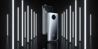
A strong influence on my product photographs, this image is most likely advertising a mobile phone. The phone is standing, which leads me to believe they have used some kind of stand behind where it isn't visible or used string and hung it. I really think the advert is eye catching, the lights on the sides of the phone give a really nice effect. The most likely used multiple strip lights to create the lights on the side, they have also used a reflective surface which really gives the image depth.
Image NO.2
My Images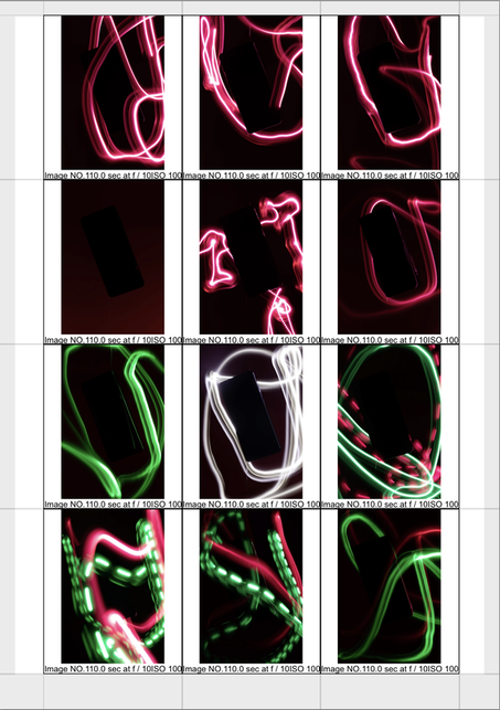
In my product, I wanted to achieve a complimentary colour scheme using the method painting with light. These images were achieved by setting the camera shutter speed to its lowest, and using a light and moving it.
Image NO.1- I used a red colour gel filter over the flashlight, I haven't attempted to achieve my desired complimentary colour scheme as this image was more of an experiment to become more acquainted with painting with light. The image overall could be improved, the light is very sporadic and messy which is visible in all of the images. Image NO.6- Once again I used a red colour gel filter over the flashlight, this image was a lot better the light isn't really harsh like the first image and is a lot less messy and feels more fluent. One possible way for improvement is getting that solid outline between the phone and the background, as it get lost in the background I could achieve this by using the more harsh light around the phone. Image NO.9- Ive used two flashlight both with different colour gel filters. In this image I have achieved my desired colour scheme although the painting with light is once again messy. What I found really interesting is making the line of light broken, as is visible in the red light I used this to separate the different lights from one another as well as the colour. Image NO.12- In this final image, I have once again accomplished my goal of a complimentary colour scheme using red and green. The painting of the light is much better in this image and a lot more subtle, but this didn't come without compromise as the phone has faded into the background and is barely visible. A way to improve would possibly lighting the background dimly so the phone is separated from the background. Edits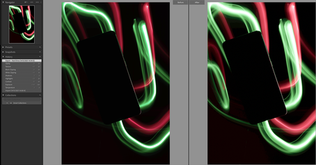
In my edit for my product I still wanted to keep it looking realistic and not make drastic changes. Most of my editing on this image was for adjusting the lighting brightness as some bits of light are dim in the normal picture.
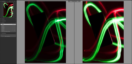
In this edit the original image overall turned out to be a bit dark, I should've adjusted the exposure to make it more brighter. I adjusted the lighting and I'm happy that the phone outline is fully visible, this is what I wanted to achieve with this edit and im happy with the way it turned out. ReferencesThe Paper. n.d. Color Theory: Color Harmonies | The Paper Blog. [online] Available at: <https://blog.thepapermillstore.com/color-theory-color-harmonies/> [Accessed 8 November 2021].
Health & Safety The studio is a room filled with equipment, which makes it more hazardous to tripping over or injury while using the equipment.
Equipment
Pinterest/Inspirations
This video by Elaine Torres, was very helpful to understand how to use colour gels (due to me never working with gels) in the studio using different techniques. She talks about using colour gels in front of the camera as a prop instead of just having the gel over the light which was an interesting concept.
Lighting Diagram

My Images
I desired, to compose my set of images using different coloured lighting, angles and back grounds to get different effects some with harsh lighting and some with the light being more focused on my model. We used a Elencrom light set to flash, in order to get the prominent colours of the background and the colour gel lighting.
Image NO.1- I wanted an overall theme for my different backgrounds, to convey a mood/expression however in the red images I forgot to get my model to be angry as this is the mood I wanted to convey with the red. I intended to harness the harsh shadow in this image, to further make the image more aggressive. In order to improve I need to think about my composition before taking the image, and think of what I'm trying to convey. Image NO.5- For blue I decided to tell my model to be more sad/glum, and try to keep the majority of the image from having shadows to show represent a bit more of a mundane but softer image. My image I think conveys the mood of sadness very well. However in order to improve, I need to use a reflector/mirror to eliminate shadows from the face. Image NO.9- In contrast to my previous images, I wanted to convey the emotion of happiness which I have achieved with the yellow lighting, yellow background and facial expressions. I wanted my light to be more focus on the model, to further accentuate the glowing happy feeling to separate the back ground from the model. In order to improve, I could've used an extra light to give a little bit more light on the background as it is a little bit too dark. Edits
I used Photoshop, to eliminate some of the skin blemishes and impurities but no too much as to make it look still realistic. The rest of my editing was done on Light Room Classic, modifications made can be seen in the image above. I think this edit was successful although having minimal changes, I wanted to keep it simple to show my understanding of using colour gels. In order to improve, I must use more Photoshop options to improve my image.

Once again I have used Photoshop, to remove some of the blemishes and impurities on the skin and have also used the skin smoother. I also used light room classic, and adjusted some of the levels in order to make the background more brighter. I think this edit turned out really well, I think the general aesthetic and mood has improved due to my editing and overall the image seems more bright. ReferencesBorrowLenses, n.d. Long Exposure Portraiture and Colour Gels- BorrowLenses Blog. [image] Available at: <https://www.pinterest.co.uk/pin/30328997481228247/?d=t&mt=login> [Accessed 9 November 2021].
n.d. ColourGelPhotography. [image] Available at: <https://www.pinterest.co.uk/pin/2955555984390909/> [Accessed 9 November 2021]. The Paper. n.d. Color Theory: Color Harmonies | The Paper Blog. [online] Available at: <https://blog.thepapermillstore.com/color-theory-color-harmonies/> [Accessed 8 November 2021]. Torres, E., 2017. Using Colour Gels with Elaine Torres. [online] Youtube.com. Available at: <https://www.youtube.com/watch?v=ZrzoC17hNb8> [Accessed 7 December 2021]. |
AuthorReiss Blackman Archives
February 2022
Categories
All
|


 RSS Feed
